YouTube video
New York City Airbnb Open DataDescription
Since 2008, guests and hosts have used Airbnb to expand on traveling possibilities and present more unique, personalized way of experiencing the world. This dataset describes the listing activity and metrics in NYC, NY for 2019.This data file includes all needed information to find out more about hosts, geographical availability, necessary metrics to make predictions and draw conclusions.
Dataset
New York City Airbnb Open DataResearch
How do we clean up these chunk data? How do we display it in batches?
After we downloaded this New York City Airbnb Open Data, the first thing that came to our mind is how to deal with this bulk dataset? There are almost fifty thousand data in this data file. So first of all, we tried to answer this question by checking that: is there any time data in the columns that we can use it as a filter? Then we found the last review information. We also found out that much data is without last review information and the number of reviews information. Therefore we removed these data. By doing so, we almost eliminated ten thousand data.Is there any noticeable difference in traffic among different areas, and what could be the reason for it?
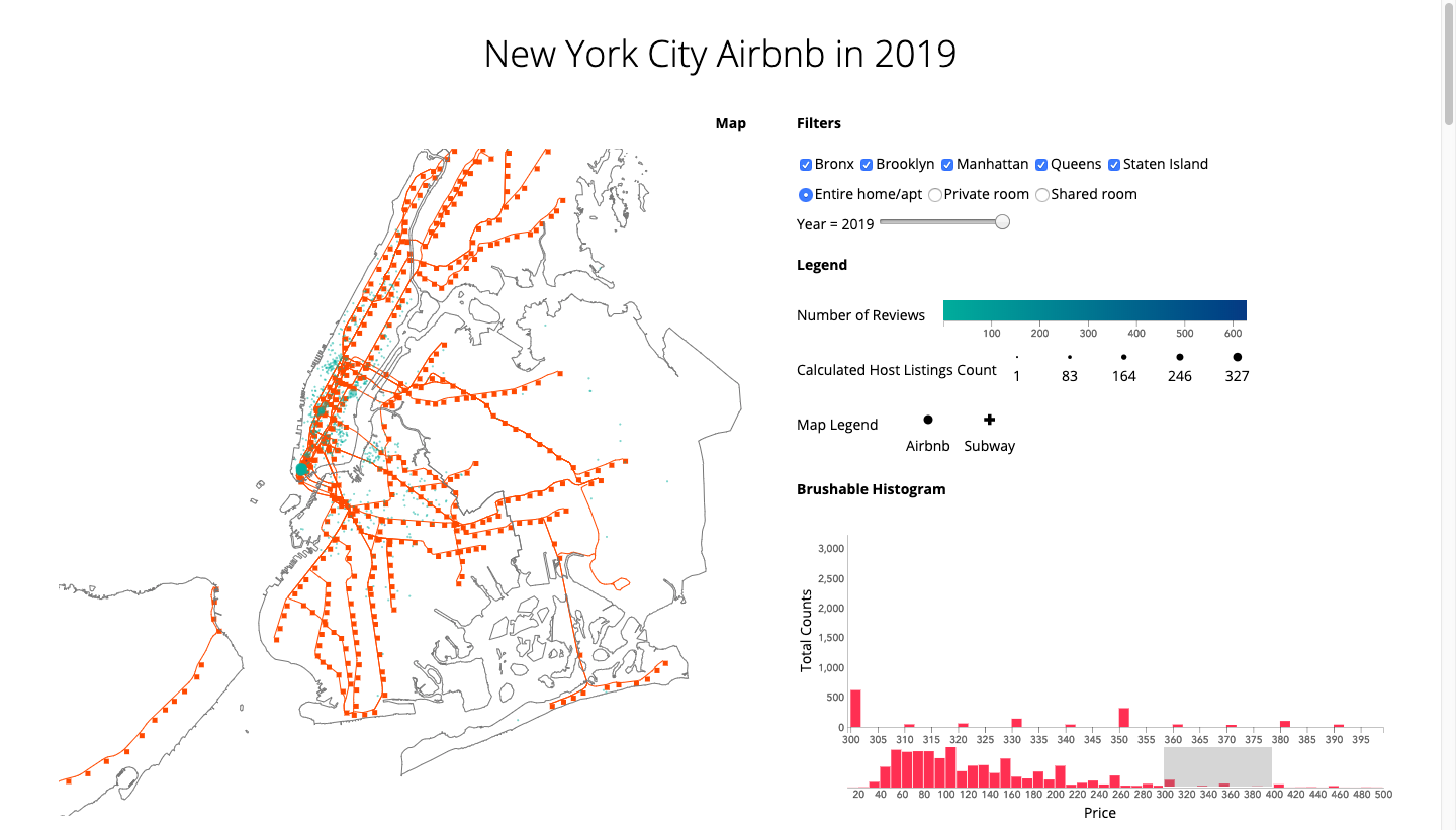
We used the latitude and longitude coordinates to generate geo JSON data and put them on the New York City map. To answer this question, we also have to point out the subway lines and stations of New York City. Besides, since there are so many points clustering in Manhattan and Brooklyn, we designed the zooming and panning function for us to view the map on a large scale map to depict a small territory. You can see that in the area which is densely populated, the Airbnb distribution has highly related to the subway stations. But outside the egg yolk area, this trend is not so obvious. We can generalize that maybe it is because of the traffic issue or the number of parking spaces. In the metropolitan area, driving is the main problem for people who are not local. And this population also is the one who has a high demand for Airbnb. Moreover, finding a parking space could deter many people from driving downtown. In summary, people who live downtown have to rely on public transportation. Therefore Airbnb in the metropolitan area has to provide its customers geo-advantage of transport.What can we learn from predictions? (ex: locations, prices, reviews, etc.)
Years (Last Review)
The data we use to filter different years is the last review information. We can see that the newest data for the last review is July 8, 2019, and this is over half of the year. If the last review time stops from 2018 or the years before, we could have a hypothesis that this Airbnb is permanently closed. Hence by displaying the Airbnb location on the map with different last review times, we can filter Airbnb, which is out of business in each since 2011. As a result of that, our final displayed Airbnbs in 2019 are twenty-five thousand data, which is almost half the number of our initial data file. You can use the slider bar to see the permanently closed Airbnb every year for 2011 to 2018.Room Types
We can check three different Airbnb room types in this data file: entire home or apartment, private room, and shared room. There is no distinguish spacial distribution for Airbnb room types in 2019. This room types attribute also serves as a partitioned data set function. We designed this radio button for displaying data in batches. As we can see here the entire home or apartment and private room are half and half.Regions
The reason that we designed the checkbox for different regions is because, during our design process, we had considered consulting the real Airbnb website and designed something with a similar function that can provide attributes for our users to select. And in the end, we found out that this checkbox could not provide us any further research insights, but since we have spent a lot of time dealing with the problem between checkbox, radio button, and slider, we still decided to keep it.Number of Reviews v.s. Calculated Host Listings Count
We used color to show the number of reviews on the map. The green dot means Airbnb with a low number of reviews, and the dark blue dot means Airbnb with a high number of reviews. We also used a radius to show the calculated host listings count. The dot with a bigger radius means the Airbnb has more hosting days this year, and the dot with smaller radius means the Airbnb has less host days this year.It is intuitive to think that the number of reviews must have a direct correlation with calculated host listings count. Since the more hosting days you get, the number of reviews you will get. But it is surprising that these two parameters have few correlations with each other. In our opinion, there are two possibilities. First, we can not tell there are positive reviews or negative reviews from the number of reviews. Maybe people tend to be more willing to leave a review when they have negative feedback compared to positive feedback. And maybe people ignore the review and only consider the price, location, or other requirement they want when they choose the Airbnb. We could not know. Second, the data we can see here are the Airbnb with the last review time in 2019. It is possible that many new Airbnbs are emerging this year, so they would not have many reviews. If people like to give a chance to the newly open Airbnbs like me, this would increase the hosting days but would not necessarily increase the number of reviews.
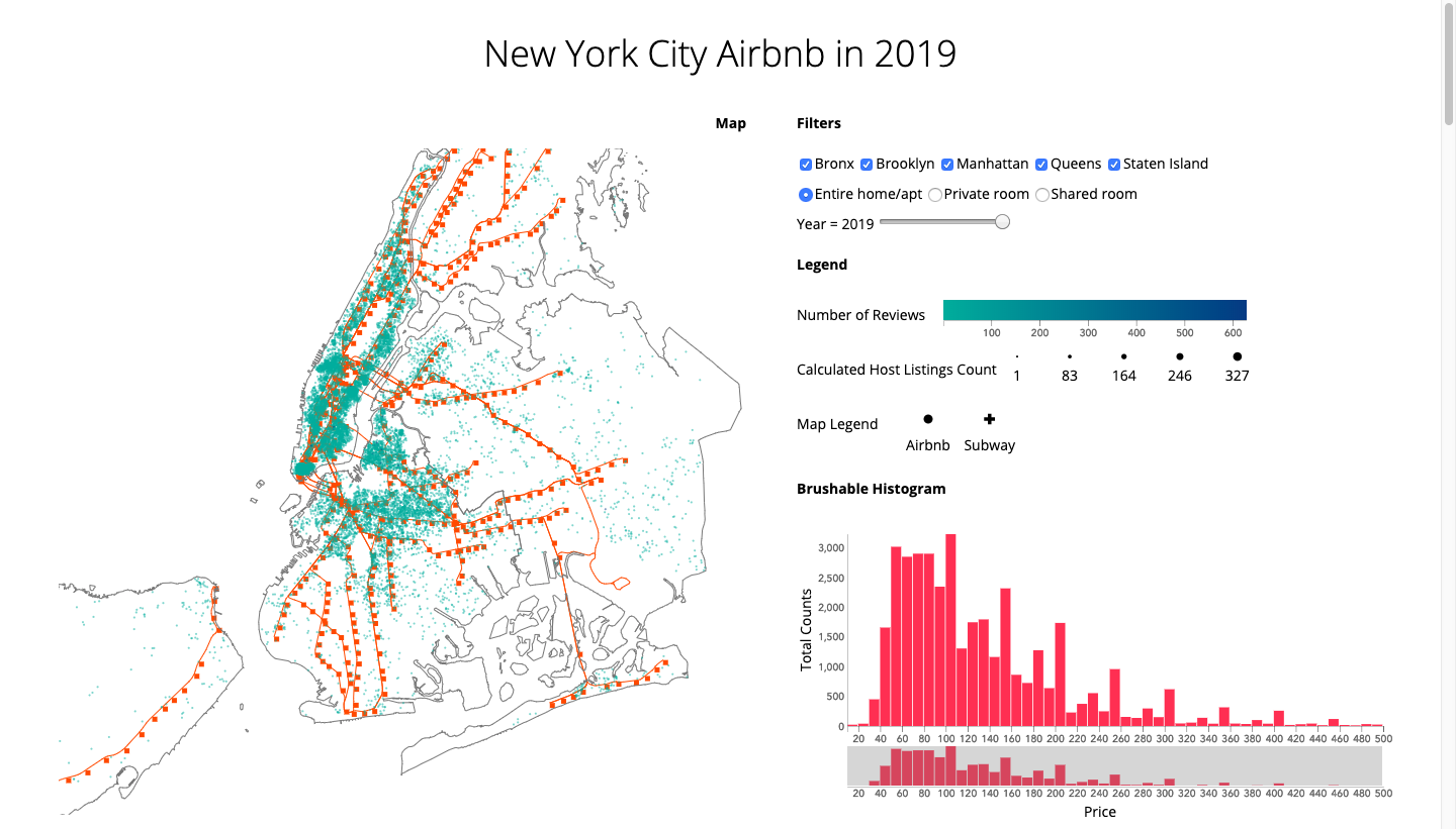
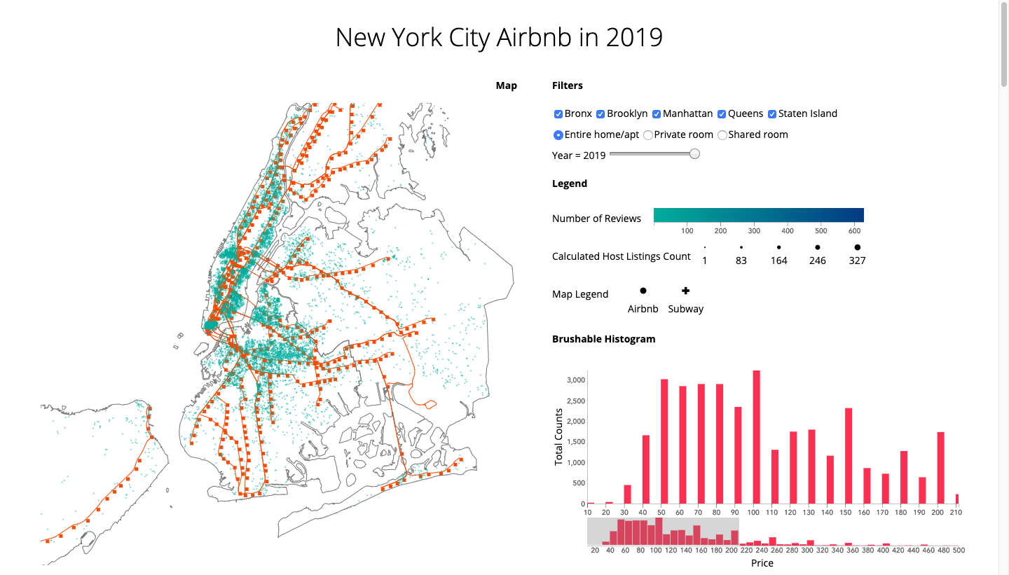
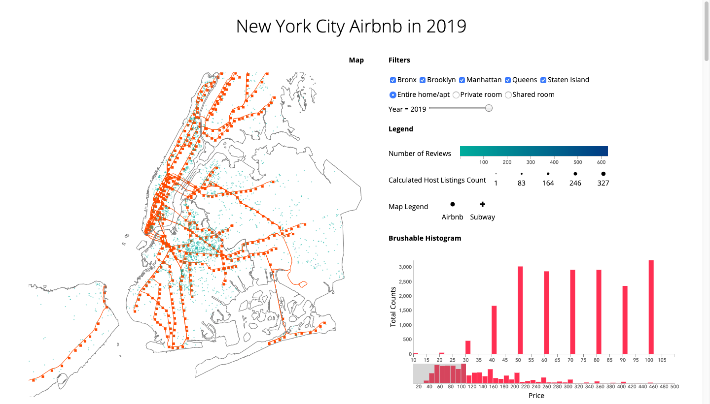
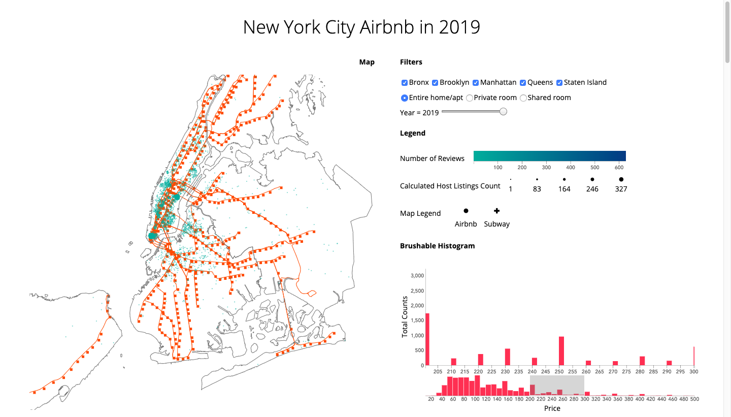
Locations v.s. Prices
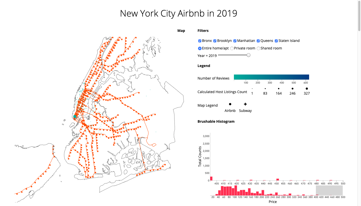
Before we analyzed price data, we found out that the price range is from 0 to 10,000. Then we realized that it is because of the minimum nights. Some of the Airbnb have the regulation that only host for a week or a month, which raises the price. After we make sure that all the price is per day, then we could start analysis the price data by using the brushable histogram combined with the map. First, we can tell that most of the prices fall between forty to two hundred dollars per day, by playing with the brushable histogram, we could check each price information on the above. Second, we can observe the location change while we set a different price ranges. The final insights could be listed in the following three points:1. When we filtered Airbnb with a price of over two hundred, Airbnb in Manhattan would be changed more than other regions.
2. The location of Airbnb with a price below one hundred is distributed equally among five regions.
3. The location of Airbnb with a price range from two hundred to three hundred is condensing on the south of Central Park in Manhattan. As we increase the price from three hundred to four hundred and four hundred to five hundred, this phenomenon becomes more obvious.
Design
Perceptual Principles
For us, the most difficult questions for data visualization are how to make complex into simple? How to make our user focus? How to design the order for our user to notice? How to tell a good story? We think the key value of visualization design is “less.” Less is more. The most efficient way to convey an idea is to convey a simple idea at one time. This semester, what we have learned could help us making data visualization easy to understand, which is also our goal. Based on this notion, we only created one map with one chart and made them on one page. As a result of condensing so much information in only two charts, our next and greatest challenge is making all spacial data with the attributes meaningful but not overwhelming. We used shape, color, radius to represent different layers, number of reviews, and hosting days. We also used a checkbox, radio button, and slider to filter regions, room types, and years. Finally, we used a brushable histogram interacted with the map to show the relationship between price and location.Visual Encoding
Before our presentation, we stuck to the color from the Airbnb company identity system. After the presentation, we took the reference of color brewer and D3 scale chromatic and decided to move to the D3 scale chromatic. Because the colors in color brewer have high saturation, but the colors for the Airbnb company identity system are more like flat design colors, which are with lower saturation. Then we picked up a color system that could be in the spirit of Airbnb.D3 scale chromatic
https://github.com/d3/d3-scale-chromaticAirbnb Colors
https://usbrandcolors.com/airbnb-colorsInteractive Map
We tried to move the subway line layer on the top of New York Map, but it did not work, so we make New York Map hollow. For the map legend, we used this resource to design the map legend:d3 SVG Legend (v4)
https://d3-legend.susielu.comIt is worth notice that this version is compatible with d3v4. In addition, we have to add the latest version of the d3-legend hosted on cdnjs, the d3 legend as a node module, and createClass via the main React package. I know nothing about cdn, npm, or react, and it is also my second time to run the terminal on the mac, so it took me some time to figure it out. It is so nice to have everything works finally.